
Is this your channel?
Home Assistant Dashboard Review with my Wife | Stream
10.4K views· 111 likes· 12:31· Jul 16, 2022
My wife and I review your dashboards and rank them! ▬▬▬▬▬▬▬▬▬▬▬▬▬▬▬▬▬▬▬▬▬▬▬▬▬▬▬▬▬▬ Drop some love to the other social media: 🐤 Twitter: - https://twitter.com/NKDZCK #HomeAssistant #Dashboards #HomeAutomation
About This Video
Frequently Asked Questions
🎬 More from Zack Barett
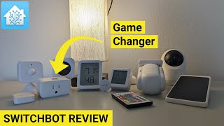
SwitchBot is finally moving in the right direction
1.8K views
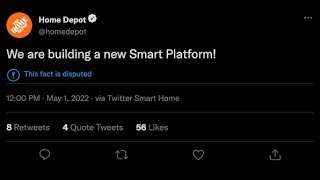
Everyone is building a Smart Home Platform these days...
2.0K views
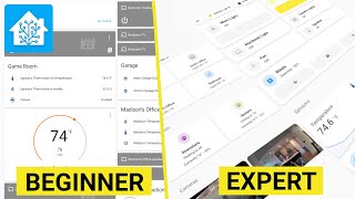
CLEANEST Home Assistant Dashboard of 2022 | How To
65.4K views
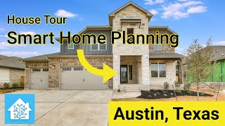
New Build: House Tour and Smart Home Plans with Home Assistant
16.0K views

I am going Full Time on Home Assistant !!!
7.8K views

Easily integrate your Cameras into Home Assistant Lovelace! | Reolink
137.3K views