
I Reviewed Your Composites for March 2026
🛍️ Products Mentioned (5)
In this video, I review the entries from the March Nucly compositing challenges and break down what’s working in each piece—and what could be improved. For every image, I go through three things: • What’s working well in the composite • What feels off or breaks the illusion • The single most important improvement I’d suggest to strengthen the piece Compositing is rarely about adding more elements. Most of the time it comes down to refining the fundamentals—light, perspective, scale, color harmony, and integration. These critiques focus on those core ideas so you can apply the same thinking to your own work. If you submitted an image, thanks for participating. The quality of these challenges keeps getting better every month. If you’d like to join the next challenge, you can do so in our Facebook group here: https://www.facebook.com/groups/nucly — Don’t forget to SUBSCRIBE and turn on notifications! And likes and shares help a lot too! Check out my full professional Photoshop training courses here: https://www.nucly.com/courses And all my asset packs here: https://www.nucly.com/tools — Follow me: Professional Training - https://www.nucly.com Blog - https://zevendesign.com Facebook - https://www.facebook.com/zevendesign Instagram - https://www.instagram.com/zevendesign 500px - https://500px.com/rikardrodin
🎬 More from Nucly • Photoshop and Creative Design Training

Photoshop Can Now Rotate ANY Object with AI… Sort Of
197 views

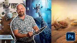
Learn Photo Compositing in Photoshop 2026 (Start to Finish Project)
1.9K views
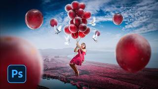
Crimson Flight: From Photos to Finished Composite in Photoshop
1.5K views
I Reviewed Your Photoshop Composites (Honest Feedback)
1.1K views

Recreate the CRIME 101 Movie Poster Look in Photoshop
1.3K views
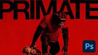
Generative AI to Graphic Design: The Primate Poster Tutorial
1.3K views