CSS Aspect Ratio

2 views· 2:07· May 6, 2024

🛍️ Products Mentioned (2)

This video is summary for the article:- https://www.gyata.ai/css/css-aspect-ratio/ Empowering Futures 🚀 Leveraging AI to provide world-class Ed-Tech solutions because learning never stops! 🧑‍💻#StayAheadOfAI 😀 Visit our website https://www.gyata.ai/ for better Learning Experience: 👨‍💻 Follow us Instagram:- https://www.instagram.com/gyata.ai/ Facebook:- https://www.facebook.com/gyataai/ Twitter:- https://twitter.com/GyataAi Linkedin:- https://www.linkedin.com/company/gyata-ai/ Your Queries:- Understanding the Concept of CSS Aspect Ratio The Importance of CSS Aspect Ratio How to Use CSS Aspect Ratio Common Mistakes and How to Avoid Them Tips and Tricks for Using CSS Aspect Ratio Conclusion #CSS #CSS3 #aspect-ratio #webdev #frontend #webdesign #developer #design #coding #responsive #layout #webdevelopment #html #csstips #css tricks #frontenddev #webdevelopmenttips #webdesigninspiration #ui #uidesign #cssmagic #flexbox #cssgrid #webstandards #creativecode


About This Video

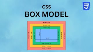
In this video, I break down the concept of CSS aspect ratio—basically the relationship between an element’s width and height, written as ratios like 16:9 or 4:3. When you understand that relationship, you can control how images, videos, and UI blocks scale on different screen sizes without stretching or distortion. This is one of those small CSS fundamentals that makes a big difference in responsive web design. I also explain why aspect ratio matters for consistency and visual balance across devices. If you want layouts that look clean on mobile, tablet, and desktop, keeping proportions intact is key. Then I walk through how to use aspect ratio in CSS by setting up a container and defining width/height so the ratio stays stable (including a simple 1:1 example). Finally, I cover common mistakes I see: forgetting how padding and borders affect dimensions, and using absolute units that don’t respond well. My fixes are straightforward—use `box-sizing: border-box` to avoid padding/border surprises, and prefer relative units like %, em, or vw for responsive sizing. I also share practical tricks like using `calc()` for height-from-width calculations (great for 16:9 blocks) and using Grid/Flexbox to help control layout behavior while maintaining the ratio.

Frequently Asked Questions

🎬 More from Gyata AI