
From Design to Code with App Builder
🛍️ Products Mentioned (4)
In this webinar you will learn how to accelerate design and app development processes and streamline the transition from Sketch designs and Adobe XD files to a full-featured modern-day app. We will showcase the design-to-code options you have with our WYSIWYG cloud-based App Builder and will introduce you to Indigo.Design. With a design system’s UI kits in both Adobe XD and Sketch, it will help you create screens and prototypes in a matter of minutes and then turn them into production-ready code with a single click. What the Design to Code with App Builder webinar will cover: - How to get the UI kits for Sketch & Adobe XD - Installing the Sketch plugin & Adobe XD plugin - Creating apps with our drag-and-drop App Builder software, using Sketch/Adobe XD files - Experimenting with pre-built design samples - How to go from design to production-ready code in both Sketch & Adobe XD - How to preview your Angular code or Blazor code, download it, and sync it with GitHub Also extremely useful: How to convert Adobe XD designs to HTML code with App Builder https://www.infragistics.com/community/blogs/b/jason_beres/posts/adobe-xd-to-html-code How to Turn Your Sketch Designs into Code https://www.infragistics.com/community/blogs/b/jason_beres/posts/how-to-turn-your-sketch-designs-into-code Learn more about our low-code App Builder™ software It is a brand-new cloud-based WYSIWYG low-code development platform and drag-and-drop app builder that eliminates the complexity behind app creation and production-ready code generation. Using it, you can start your business app from scratch or choose from a library of pre-built app templates or responsive screen layouts. The unique differentiator between App Builder and other low-code tools on the market is the production-ready code that comes with any Blazor or Angular app built with our app maker, the instant real-time preview of your app and code, and the ability to download your project as a zip file or publish it on GitHub. The benefit of the App Builder being backed by a design system is that it has a toolbox full of UI controls. Each one of these UI controls is represented via a UI Kit in Figma, Adobe XD and Sketch and a real component that we ship as part of our Ignite UI product in Angular, Blazor, React and Web Components. Like any WYSIWYG drag and drop tool you can drag anything from the toolbox onto the screen and it will be seated within the layout of the screen Learn everything about our app maker at: https://www.infragistics.com/products/appbuilder What is Indigo.Design best for? Delivering best-in-class UX and UI designs with customizable components. Working with designers’ favorite vector design tools like Sketch, Adobe XD, and with full support for Figma coming soon. Co-editing and collaborating with teams, stakeholders, and customers via secure workspaces. Performing remote and unmoderated user testing with real-time analytics. Providing inspect tool (just like Zeplin) to get CSS, colors, size / positioning code from your designs. Data sources options that let you connect to any REST data source or other common data sources. Theme options including built-in themes and a custom theme builder. WYSIWYG app design and construction, with instant real-time code preview and code generation for Angular and Blazor (React, Web Components coming soon). Super easy to learn and integrate. Learn everything about Indigo.Design at: https://www.infragistics.com/products/indigo-design #lowcodedevelopment #appbuilder #designtocode
🎬 More from Infragistics
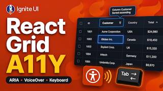
Accessible React Data Grid: ARIA, Screen Readers & Keyboard Navigation
37 views
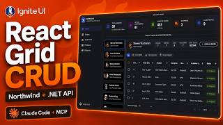
React Data Grid CRUD Tutorial with Ignite UI for React and .NET API
120 views
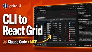
React Data Grid Tutorial: Ignite UI CLI, Claude Code & MCP
147 views

React Data Grid Tutorial with Claude Code, MCP Servers & Ignite UI
87 views
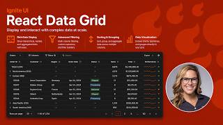
React Data Grid Explained: Features Every Enterprise React App Needs | Ignite UI
62 views
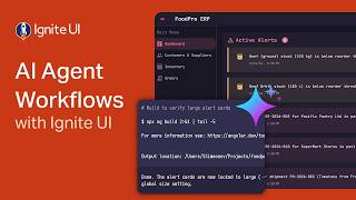
AI Agent Workflows with Ignite UI
141 views