
How to use lettering in your journals
This is a basic overview on the principles of type contrast for my journaling people who aren't into design but want to know the basics to improve their layouts. I'm surely forgetting information here, and it's not meant to be comprehensive but rather a starting point. Hopefully you find it helpful! Also, there’s a typo. Oops. I meant to put sans-serif and not san-serif.
🎬 More from wordlayout
Journal With Me: Inspired by medieval illuminated manuscripts, gold leaf, and gothic lettering
3.8K views
Journal Flipthrough: Ideas for combining gothic lettering and medieval themes with journaling
7.2K views

Journaling Room Tour: My setup and organization
9.1K views
Journal With Me: Medieval style & gothic lettering
42.9K views
Fountain Pen Collection Tour: 3 years and 90+ pens later
9.1K views
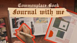
Commonplace Book: Journal with me about art & creativity
6.2K views