Is this your channel?
Frosty Rose
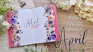
Frosty Rose was my main accent tape for this April flower theme, especially because it brings in that dark blue that makes the whole palette feel more grounded. I love using the bigger designs first to cover space quickly, then pairing it with smaller florals to fill gaps. It’s one of those tapes that looks even better once it’s actually on the page.
Buy on Thewashitapeshop
You'll be taken to Thewashitapeshop to complete your purchase.
Pros
- +Dark blue tones make a great accent color in floral themes
- +Bigger designs help cover space faster on spreads
- +Pairs surprisingly well with other softer floral tapes
Cons
- -Darker tones can feel heavy if you don’t balance them with lighter elements