
The saturation check you should be doing (but probably aren't)
🛍️ Products Mentioned (9)
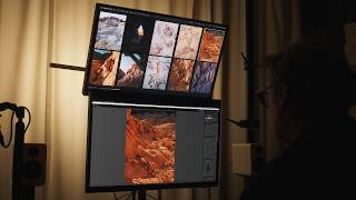
Most editors add saturation by feel. Here's a quick Lightroom trick that shows you exactly where color is too hot, too flat, or just right, before it becomes a problem in your final edit. 0:00 Intro 0:44 Over-saturated 2:17 Under-saturated 3:14 Handling over-saturation 4:22 HSL sliders 5:40 Point color 8:05 Color range mask 8:49 Outro 🎒 GEAR AND LINKS What’s in my bag: https://bit.ly/dominey-gear My LUTs and presets: https://dominey.lemonsqueezy.com/ Music and SFX for videos: https://bit.ly/dominey-epidemic-sound Photography: https://dominey.photography Blog: https://blog.dominey.photography Instagram: https://instagram.com/dominey Glass: https://glass.photo/tdominey Email: dominey@gmail.com LEGAL DISCLOSURE Some of the links in this description will direct you to online stores where I may earn referral credits at no additional cost to you. If you want to shop and support this channel, you may also use the following storewide links. 🛒 Amazon: https://geni.us/gotoamazon 🛒 B&H: https://geni.us/shopbandh 🛒 Adorama: https://geni.us/shopadorama
🎬 More from Todd Dominey
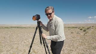
Wind is the enemy of sharp photos. Here's how to beat it.
2.0K views
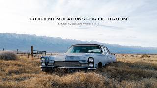
Real Fujifilm film colors: Color Precision profiles for Lightroom
7.6K views
Mora
4.4K views
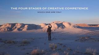
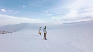
You're not a bad photographer. You're just in stage 2.
6.4K views

Why your shadows look fake (and what to do about it)
8.8K views
A second monitor changes everything
5.2K views