
Turquoise in Watercolour Subtle, Supporting & Surprisingly Useful
Turquoise in Watercolour: Subtle, Supporting & Surprisingly Useful Get brushes and signed copies of my books here! https://dewintonpaperco.etsy.com Turquoise is rarely the colour that takes centre stage in my paintings — and yet it plays a much bigger role in my palette than you might expect. In this video I’m talking about the two turquoise shades I keep on my watercolour palette and why I find them so surprisingly useful, especially as supporting colours in mixes. I share how turquoise subtly shifts greens, cools shadows, and adds depth and freshness without overpowering a painting. I also talk about the kinds of subjects where it sneaks in quietly, and why having turquoise ready-made can be far more effective than trying to mix it on the fly. If you’ve ever dismissed turquoise as too bright or too specific, I hope this video gives you a new way to think about it — not as a statement colour, but as a quiet helper that makes other colours work better. Let me know in the comments: do you use turquoise in your palette, or is it a colour you’ve overlooked? Join this channel to get access to perks: https://www.youtube.com/channel/UCLc91tlwoZD6i_4RXKtCH0Q/join
🎬 More from de Winton Paper Co.
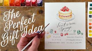
The Secret to Beautiful Hand-Lettered Recipe Cards | Watercolour Tutorial
1.8K views

An Illustrator's Dream Day at the Quentin Blake Centre
3.8K views
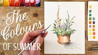
Foxgloves, Lupins & Summer Sunshine | Watercolour Tutorial
5.5K views

The Secret to Bringing Flower Paintings to Life: Add Bees!
6.4K views

My 2027 Painting Retreats Are Here! | Watercolour Travel Adventures
3.7K views
Pick the Perfect Watercolour Brush Every Time
2.8K views