
LinkedIn Banner Design Crimes I Background Blunders That Cost Jobs
Career Coach Warning! Don't be a victim of LinkedIn Banner Design Crimes as these LinkedIn background blunders may cost jobs. Hey there it's Karalyn Brown, your friendly and helpful career coach, is back with a reality check on LinkedIn banners. Don't be a victim of design crimes! In this video, I've rounded up five examples of terrible LinkedIn banners that will make you cringe. From overcrowded layouts to mismatched images and confusing fonts, we're dissecting the design fails so you can avoid them. Meet Jane, Mary, Dr. Blogs, and the guy with the pixelated, nauseating colors—each with their unique banner blunders. Your LinkedIn banner is your online business card, so let's make it count! Learn the dos and don'ts, like keeping it clean, focusing on one key idea, and avoiding the unnecessary (bye-bye, your name on the banner). Watch and learn as we uncover the secrets to creating a killer LinkedIn banner that screams "hire me" without the cringe. Ready to level up your online presence? Check out the link in the description for examples of killer LinkedIn banners. GET STRAIGHT TO THE GOOD BITS 00:00 01:24 Bad LinkedIn Banner Design Crime No.1 Too overcrowded 02:07 Bad LinkedIn Banner Design Crime No.2 No names please and keep the look unified 02:48 Bad LinkedIn Banner Design Crime No.3 Were they even thinking? 03:34 Bad LinkedIn Banner Design Crime No.4 When Doctors take their own medicine 04:14 Bad LinkedIn Banner Design Crime No.5 What were they even thinking? EXAMPLES OF GREAT LINKEDIN BANNERS https://www.youtube.com/watch?v=sEdVM-_LJFI
🎬 More from Career Care Package

Resume Skills Section Hack Using ChatGPT to win interviews
528 views
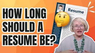
How Long Should a Resume Be? (The Truth Nobody Tells You)
538 views
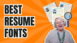
Best Resume Fonts: How to make your resume look more professional
468 views
How to write achievements in resume | CV achievements
2.2K views
Storytelling Resume | How to make a resume that stands out to recruiters
744 views
Career Change Resume Example | Simple, Yet Effective Template | Resume Breakdown
1.1K views