
Is this your channel?
↳ App icons (muted pastels)
↳ App icons (muted pastels)
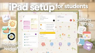
These muted pastel app icons are the exact set I used to make my iPad look visually cohesive, and yes, I changed each icon one by one. You don’t have to customize everything, but if you want a clean, consistent home screen, this makes the process way easier.
Pros
- +100+ icons for a cohesive home screen look
- +Saves time versus designing icons from scratch
Cons
- -Still requires manual setup through Shortcuts
Featured in 2 videos

↳ App icons (muted pastels)
Available on Ko-fi
External purchase
Highlights
- +100+ icons for a cohesive home screen look
- +Saves time versus designing icons from scratch
Recommended by
Patrisha Dictado