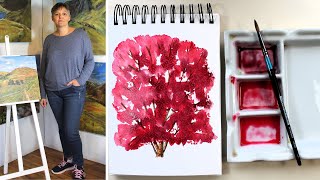
Is this your channel?
Reference Photo
I use this reference photo as a loose guide for the cherry tree shape and the general feel of the blossom. I’m not trying to copy it exactly—just using it to keep the proportions believable while I paint freely.
Buy on Pixabay
You'll be taken to Pixabay to complete your purchase.
Pros
- +Clear subject to guide a simple tree composition
- +Helpful for beginners who want structure without over-detailing
Cons
- -A photo can tempt you into painting every detail instead of staying loose
What Cally Lawson says
“at first glance this reference photograph of this cherry tree looks very simple but the reason I chose it was because of the light and I thought this would be something that nice that we could do just using a few colors looking at that light and shade in this cherry tree so we're going to totally ignore the background and just look at the tree itself and to begin with we want to look at the shape and size of it and how small this trunk is compared to the rest and the rest really fits into more or less a square or an oblong and we've got this tiny bit of trunk at the bottom so you need to leave all this space at the top of your paper for the rest of your tree and just do a very small trunk now look at where the lights coming it's very obviously coming from this side all this is catching the Sun and if we look at the trunk the trunk is catching the sun down there as well and then it's much more in the shade here it's in the shade in various parts here where the light can't just get into the tree itself so we're going to paint this very simp simply wet and wet with just a few lines of drawing for the trunk and some of these upper branches the pen I'm using today is a pigman Micron and it's a size three black one so just starting with the front part of the trunk and it's got quite a few different bits going off it if we actually look at it and just up to where the foliage starts so we don't want to be putting every detail of this trunk in just a few very stylized kind of a painting with the as far as the drawing's concerned nothing too complex we've got another one going up up here so now let's look at the light and the light can't get to very much of this trunk on this side at all so we can build up some Shadow with the pen and make it go around the trunk keeping it very very simple some very light lines again this one back here not getting much light at all under here and the same with this back one getting very little light to the whole thing it's in the shadow of the foliage sorry the blossom above it this one is actually much more in the Sun and it's got a little bit of Shadow over this way okay so that's all I'm going to do for that drawing at the moment we can then put some branches further up just where you see the the most obvious and I'm not going to copy exactly what's on the photograph I'm just going to give a feel for it don't put every single one in just put some of the most obvious shapes that you can see in and again put that shadow in with your pen I use little dashes but you could do something slightly different you don't have to do the same as me just vary these branches a little bit some of the angles and the way that they're branching off you can see more of them at the base and you can in the center this kind of area here is very full of Blossom and you can add some later after we've done all the painting so you don't have to worry about getting them all in and like I said just do a few to give that impression rather than worrying about where every single one is as you come up and they get thinner you might not want to bother quite so much with the shade you just use the actual line itself put the two lines very close together here you can see quite a grouping of them there again I'm not putting them all in now as you get to the top of the tree you want to look at the shapes at the top we get this shape where they go off and they get finer as they get to the end now for some color on those trunks and branches and I've got burnt sienna and in this one I've got warm sepia with some alizarin added just to make it a touch darker so I'll start off with a lighter color both of these colors are a very similar consistency and I'll put that over the drawing of the trunk and the branches don't forget with your watercolors that these are going to dry lighter than they go on so this is going to be quite nice and Light if you have a decent brush you'll find this much easier that your brush holds plenty of paint and you can do them all without having to keep refilling too often so this one's a size six round brush when you fill your brush up just make sure it is full and then you can paint for longer without having to stop don't worry about going over the lines a little bit like I have done there and These Fine Lines just do one sweep of the brush and you may want to turn it over as well to stop your hand resting on where you've painted I'm a bit wobbly this morning bit tired and turn it over is an easy way to to work sometimes as well when you've done that get your darker mix and put it on the side of the trunk just dab it in where it's going to be darkest on the side of the branches as well and all this is although this is going to be quite a stylized kind of illustr illustrative little painting it does give that little bit more 3D realism to it by having that shadow down the one side so just take your time and pop the dark in and you don't have to do everyone you could leave some of these end ones a little bit lighter where they catch you more sun and just put touches of the dark in here and there you can see what a nice rich color that is with adding that little touch of red to it do keep the paint that you've got left after you've done this because later on when we finished all the blossom you might want to add some extra Shadow and branches in for the next part I've mixed up my colors and this one is Carmine with plenty of water and the next two colors are thicker with less water in them so this one is Carmine with azarin added and this one is a lizin with some dioxazine purple added to make a really dark Rich color so the pink and the purple together there make a lovely color for those Shadows at the bottom of the tree I've got a slightly bigger brush because I want to work more more quickly so this is a size six so I need to load that up when you're putting your first wash of color on you might want to do it in this kind of the shapes of the way the blossom is at the tips there it comes down in a a bit of a triangle which you've already put there with some of these tips so the photograph we've using is just a guide uh to get the feel of the cherry tree and the blossom don't feel that you have to do it exactly as it is I stopped talking there because my husband was outside with the tractor making an awful lot of noise so I've cut that out um but you can see that I've just carried on just wriggling my brush around leaving little chinks of white Bits of Paper especially where we can see those branches but you can see you're already building up that nice shape um so use the tip of your brush to make some edges and just make it a little bit uneven in places so then you need to load your brush up with the next thicker color and start and have a look at where some of those darker areas are and we're just going to drop it in so there's some areas where the light just can't get to and you need to do this quickly whilst it's all still wet you don't want to be doing this once it's dried so if it starts his tractor up again I'm sorry we'll just have to carry on regardless so we don't want too much over this side because it's darker over this side but it is darker in the base of some of these little what we call triangle shapes before upside down triangles where you've got these shapes of the branches going off and then you get the shadow in the base there you can see because of the pad the pad's kind of curling over a little bit like this I haven't taped it down I've got pools here so what I'm going to do is just sock a little bit of that up once I've got all the color on just so that it doesn't make cauliflower shapes okay so when you feel you've got enough of that second color on and you want to go to the really dark areas then we can load our brush up with this lovely Rich color with that purple in so underneath here down at the base and don't forget that this photograph is just a reference it's just to give us these ideas we not copying it completely and if you want to go over some of the branches that's absolutely fine but right down at the base here the light's really not getting there because it's coming from this side but you do see one or two areas where the light's bouncing around and we've still got some light so we don't want to obliterate it all and this is why you need this to be a thicker mix than the first mix that we had so that it doesn't just fly out into that damp paper and cover all those lovely pinks that we've already got there and this extends right up to the top these shady areas over this bit here it's a little bit lighter so we don't want to overdo the darks one or two at the top here just to give us some variety and at this stage you want to just stand back and have a look at it see where you feel it needs a little bit of alteration bit more detail maybe and I'm going to dry that brush off you won't see me off camera but how I dry it off is to flick it across the floor so my floor is a real mess and then I'm just going to Sock up a little bit of that paint from this side where it's pooling a bit so you could have your um paper tape down and you wouldn't have this problem but don't worry too much about that cuz actually where it dries and makes cauliflowers you it's with something like a bush or a tree sometimes it can actually work to your advantage so while it's still wet and you got a dry brush if you wanted to you could just take a little bit more light out at the very lightest areas and if you use your brush on its side like that you can make tree branchy shapes so the paint's already on the paper it's still wet and we're just kind of moving it around and playing with it a little bit there just to catch some of those lighter areas and shapes as well you might want to just roll your brush a little bit there's a lighter area here where it goes down across and it's just that variety between the light and the dark that we're looking for so you can go back to your dark and increase it in certain areas so that we got a nice contrast between the darkest and lightest areas because like I say as it dries it's going to go lighter anyway so your darts probably won't be just as dark as they are on the photograph we've got that nice variety and also at this stage if you wanted to with the other two colors or with this middle color you could just pop some individual little bits of looking like the're little bits of petals in one or two of these white patches just to give it a bit more form and even on the outside edges just make it a bit more interesting so you could have a go at doing this several times get some practice paper out and you could also do it with some green trees you don't have to do it with Blossom you could pick some other trees to do this with and just have a bit of a practice at doing a very simple shape with your trunk then putting these wet and wet colors on top and the main thing really to remember is to have these two thicker than your first one you can always start with water if you want you don't have to start with a color you could just put some water on to begin with I think just putting one or two little dots and dashes around the edges just makes it a bit more interesting okay so I'll leave that now to completely dry and then I'll take a photograph of it so that you can see what it looks like once it's dried you will see that it be a lot lighter and if you wanted to you could come back and put more of the dark colors in here and there I'll link this reference photograph for you in the description below but like I said it's just that it is just a reference it's just something to work from don't feel that like you're copying it you're just looking at that light and shade and and practicing mixing those wetting wet colors on the paper the paper that I've used is the A5 bockingford block which is a lovely paper to work wetting wet onto and I'll also link that down in the description for you so let me know what you think in the comments below let me know if you've got any tips for everybody else about working wetting wet um and also about painting trees okay I'll be back again soon with another tutorial or demonstration thanks very much for watching and bye-bye for now”